
Working with images on a Retina Display
Recently I bought a macbook pro with retina display and I realized that in some websites the images were appearing fuzzy and with low resolution. It occurs because the retina display contains more pixels in the same physical size, and a lot of websites are not prepared to it.
Pixels
Let’s assume the following code
<img src="image.png" width="100" height="100" />
The above HTML code will show us on the screen an image of 100px by 100px (CSS pixel) on a non-retina display while on a retina display is necessary an image of 200px by 200px to retain the same physical size.
Resizing Images
1. Single image with double size
Suppose we need to display an image of 100px by 100px in our website. To make it work well on a retina display we need an image of 200px by 200px and resize it using CSS.
.image{
  background-image: url(image@2x.png); /* image@2x.png = 200px by 200px */
  background-size: 100px 100px;
  height: 100px;
  width: 100px;
}
We could make it this way as well.
<img src="image@2x.png" width="100" height="100" />
Both work fine but there is best ways to do it. If you are using a non-retina display, why do you need to load a double size image? You don’t! Let’s see the next examples.
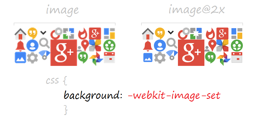
2. CSS: -webkit-image-set
This option is very useful and work well with image sprites. The browser is also smart enough to know which image should download. It means that who has retina display should spend more data usage.
.image{
  background-image: url(image.png);
  background-image: -webkit-image-set(url(image.png) 1x, url(image@2x.png) 2x);
  background-size: 100px 100px;
  height: 100px;
  width: 100px;
}
3. HTML: srcset
The srcset attribute on img is very similar to -webkit-image-set. On browsers without srcset support, the value of the src attribute will be used. On regular resolution displays, the 1x variant of the srcset will be used. On displays with 2 device pixels per CSS pixel, the 2x variant of the srcset will be used.
<img src="image.png" srcset="image.png 1x, image@2x.png 2x" />
4. Using JavaScript to replace all the images
Replace low resolution images with double resolution images can take a long time. We can use JavaScript to replace all images in a webpage. I’ve made my own script and worked like a charm.
(function(){

  if (window.devicePixelRatio > 1) {

    var images = document.getElementsByTagName("img");

    for(var i=0; i<images.length; i++) {

      images[i].width  = images[i].clientWidth;
      images[i].height  = images[i].clientHeight;
      images[i].src = images[i].src.replace(".", "@2x.");

    };

  };

})();
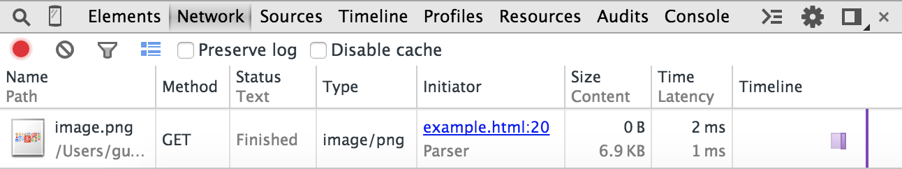
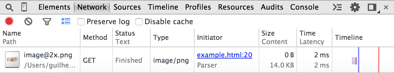
Network test
The test is very simple and basically we can say that who has a computer with a retina display is spending more data usage.
Non-retina display
Retina display
Conclusion
We have seen some ways on how to implement images with good definition on devices with retina displays. If you are a web designer or just want to improve your knowledge, I really recommend these techniques.
If you are working with icons, a good option is to use @font-faces instead of images. Today, there are many good quality icon fonts that can meet your requirements for website design.
Favicons also need to be in a better quality on a retina display. You can export a 32px version to make a favicon Retina ready.