
CSS Font-Size and Units of Length
The number of devices accessing the same data and the same page grows fast. Creating a modern web page that makes every device view the same content in a simplified and adjusted way can be a challenge.
In this post we are gonna see the font-size property and the units of length, which will help you to understand and to create a responsive web page.
How many units of length does exist?
There are a lot of units of length and they can be separated as relative length and absolute length.
Relative length: relative to another length property. Units: em, ex, ch, rem, vw, vh, vmin, vmax and %.
Absolute length: fixed and will appear as exactly that size. Units: cm, mm, in, px, pt and pc.
Main units
The main and more used units of length are: px, em and %.
PIXELS (PX)
Have a fixed size and don’t change. Ems are relative to the font size set in the CSS. If you are accessing on a screen with higher resolution, the fonts will be rendered smaller. It’s good and bad at the same time, just depends on what you need.
EM
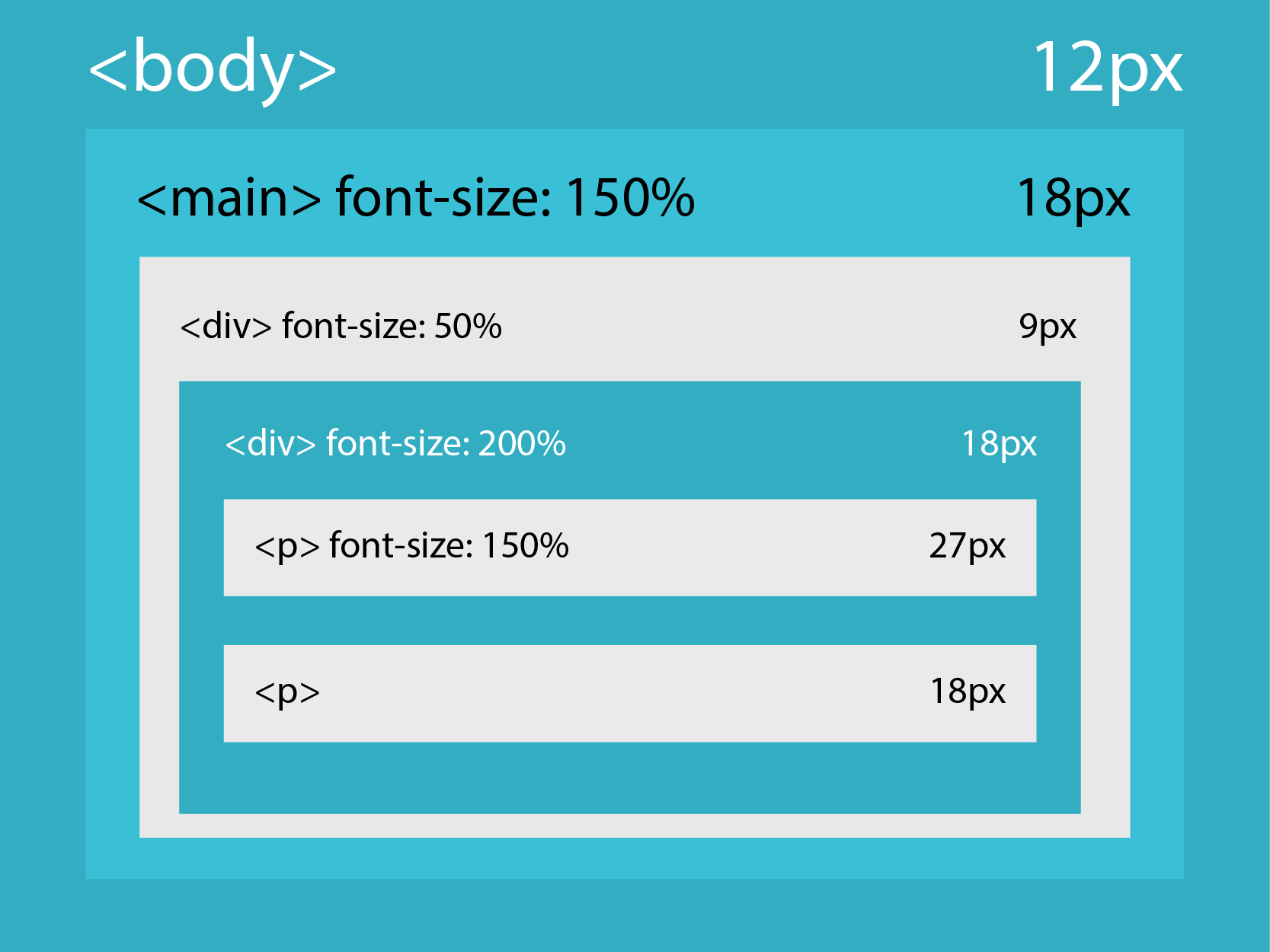
Don’t have a fixed size and can change. One good thing is that they are scalable, in other words, good for mobile web development. One “bad” or complicated thing is that they cascade, making the perfect pixel more difficult. For example: 1.2em of 16px = ~19.2px
PERCENT (%)
Don’t have a fixed size and can change. Very similar to EM unit, however using percentage. For example: 1.5em = 150%
Conclusion
These three kind of units are good to use in font-size property. You just need to adjust and to select the best for your project. Relative lengths can be a good choice for web development and for a responsive design. If you have never used other unit but pixels, try to use percentage, they are very good and it’s popularity is growing.